For decades, the standard operating procedure for data analysts has remained stubbornly manual. A CSV file lands in an inbox, an executive asks, "How did we perform this month?", and the analyst embarks on an afternoon of repetitive labor: scrubbing inconsistent columns, pivot-tabling the results, constructing charts, and laboriously drafting a narrative summary.
This cycle is not just tedious; it is a bottleneck that prevents data professionals from focusing on high-level strategy. However, the convergence of robust Python automation and large language models (LLMs) like Claude Opus 4.8 has fundamentally changed the calculus. By building an automated pipeline, analysts can shift from being manual laborers to "architects of truth," allowing machines to handle the heavy lifting of data preparation and narrative drafting while humans retain final editorial control.
The Case for Automated Intelligence
The core of modern business intelligence is not just collecting data; it is synthesizing it into actionable information. Every report requires a fundamental inquiry. In this practical application, we seek to answer a classic business question: "How much revenue did we retain over the last five weeks, and where did the remainder go?"
To answer this, we move beyond simple summation. The workflow follows a rigorous logic:
- Cleaning: Determining which data points represent legitimate revenue.
- Aggregation: Identifying the "where" and "when" of financial leakage.
- Visualization: Creating visual artifacts that highlight performance trends.
- AI Synthesis: Transforming raw figures into an executive-level summary.
This methodology ensures that the AI functions as a tool for efficiency rather than a substitute for human intuition. As we will explore, while the model can generate a coherent narrative in seconds, the human analyst remains the final arbiter of what constitutes "truth" in the data.
A Chronology of the Pipeline
To replicate this process, one must treat the data as a narrative that requires structuring. Using product_sales.csv—a dataset comprised of 45 transaction rows—we can observe the lifecycle of an automated report.

Phase I: The Data Foundation
Raw data is rarely "report-ready." Upon inspecting our transaction log, two immediate anomalies appear: refund statuses are represented by negative values, and not all entries represent finalized sales. Utilizing the Pandas library in Python, we isolate the noise:
import pandas as pd
df = pd.read_csv("product_sales.csv")
df["transaction_date"] = pd.to_datetime(df["transaction_date"])
df["amount"] = pd.to_numeric(df["amount"], errors="coerce")
# Filtering out pending or failed transactions
settled = df[df["status"] == "completed"].copy()
This simple filter reduces our dataset to 42 high-quality transactions. Without this programmatic intervention, an analyst might erroneously include failed payments, leading to inflated and inaccurate reporting.
Phase II: Exploratory Analysis
Once the data is cleaned, the narrative emerges through aggregation. By calculating gross revenue, refund totals, and net revenue, we arrive at the headline figures. A 38% refund rate, for instance, is a critical KPI that remains hidden if an analyst only considers "positive" sales.
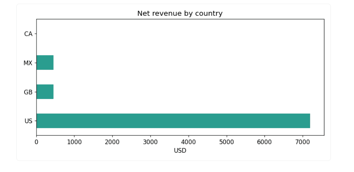
We then expand our scope, grouping by country and week. The data reveals a stark reality: while the U.S. and other regions show consistent engagement, Canada presents a specific anomaly—two completed orders, both fully refunded, resulting in a net revenue of zero. This is the "Aha!" moment of analysis that requires human investigation.
Phase III: Visualizing the Story
Matplotlib serves as the bridge between raw numbers and executive understanding. We generate three core visualizations:
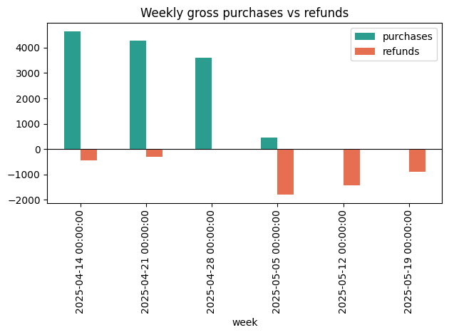
- Weekly Comparison: A bar chart juxtaposing gross purchases against refunds, making the "refund wave" in May visually undeniable.
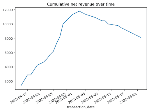
- Cumulative Revenue: An area or line chart showing the trend of net revenue over time.
- Geographic Distribution: A horizontal bar chart identifying which markets are performing well versus those hemorrhaging value.
Supporting Data: The Quantitative Breakdown
The strength of this automated approach lies in its precision. In our sample dataset, the weekly breakdown of net revenue tells a story of decline:
| Week | Purchases | Refunds | Net |
|---|---|---|---|
| 2025-04-14 | $4,649.89 | -$449.99 | $4,199.90 |
| 2025-05-12 | $0.00 | -$1,424.96 | -$1,424.96 |
The temporal lag is equally telling. By mapping original_transaction_id to refund dates, we discovered a median lag of 20 days. This provides an essential insight: the revenue we celebrated in April was being clawed back by refund requests throughout May. This correlation is the type of deep-dive insight that transforms a spreadsheet into a strategic advisory tool.
The Role of AI: Synthesizing Insights
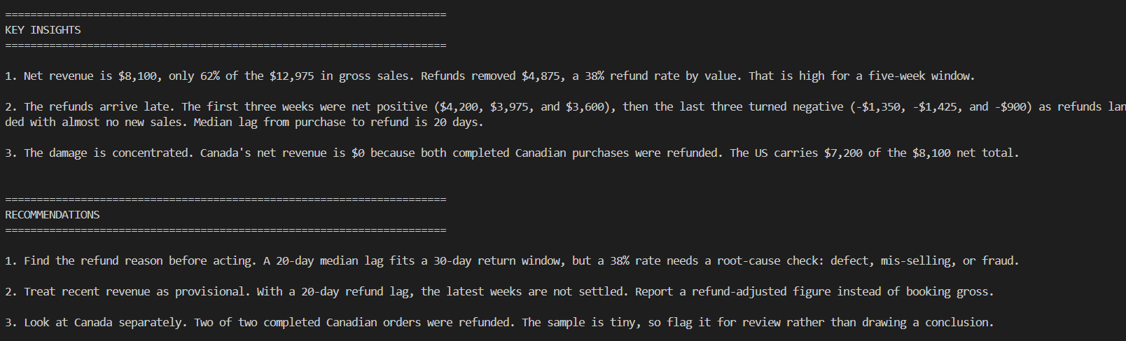
Perhaps the most significant advancement in this pipeline is the integration of LLMs for narrative generation. We pass a structured summary to the AI, prompting it to act as a senior data analyst.
The Prompt:
"You are a data analyst writing for executives. Based on this summary, write 3 insights and 3 business recommendations. Be specific and cautious about small sample size."
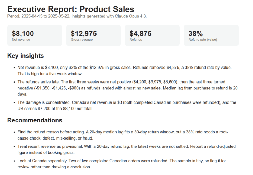
The AI’s response is not merely a summary; it is a professional synthesis. However, it is vital to acknowledge the "Official Response" of the model: it consistently highlights its own limitations. It recognizes that it lacks the broader context of the business and the historical patterns beyond the current dataset. This caution is the mark of a well-calibrated tool, ensuring that executives do not overreact to what might be statistical noise.
Implications for the Future of Data Science
The implications of this workflow are twofold: professional and organizational.
Efficiency and Scaling
For the individual analyst, this pipeline removes the "afternoon of chores." By automating the repetitive tasks of cleaning and drafting, the analyst can process a dozen reports in the time it previously took to finish one. This creates the bandwidth to pursue more complex statistical modeling or engage in long-term project planning.
The Human-in-the-Loop Necessity
Despite the efficiency, this workflow reinforces the necessity of the human element. An AI can parse a 38% refund rate, but it cannot know if that rate is the result of a faulty product launch, a change in return policy, or a seasonal dip. The "Human-in-the-Loop" (HITL) model is not just a safety feature; it is an analytical requirement. The analyst must decide whether the insights generated are actually relevant to the current organizational goals.
Democratizing Data Reporting
Finally, the ability to generate a self-contained report.html file—complete with charts, metrics, and narrative—means that high-quality, professional-grade analytics can be delivered to stakeholders who do not have access to Python or the original dataset. It bridges the gap between the technical backend and the non-technical boardroom.
Conclusion
The evolution of reporting from manual spreadsheet manipulation to AI-assisted pipelines represents a significant maturity in data practice. By utilizing Python for the heavy lifting of data hygiene and aggregation, and leveraging LLMs for the synthesis of narrative, analysts can elevate their output from "data entry" to "strategic consultation."
The key takeaway is that the tool does not dictate the outcome—the analyst does. The pipeline acts as an amplifier of the analyst’s intent. By standardizing the clean-explore-chart-insights loop, any data professional can turn a pile of raw transactions into a coherent, executive-ready report in a fraction of the time, leaving more room for the one thing computers still struggle to do: provide genuine business wisdom. As we move forward, the most successful data scientists will be those who master these pipelines, using them to ensure that their organization is not just looking at data, but truly understanding it.